
MALTESER Hospitaldienst Austria
Non-Profit, Healthcare
2022
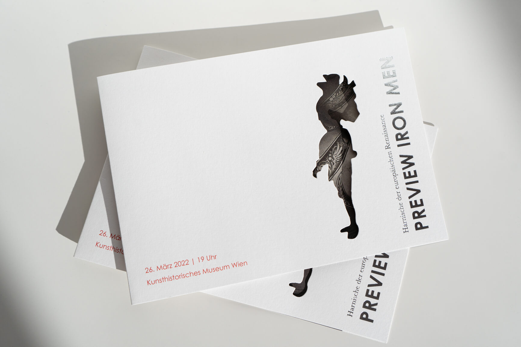
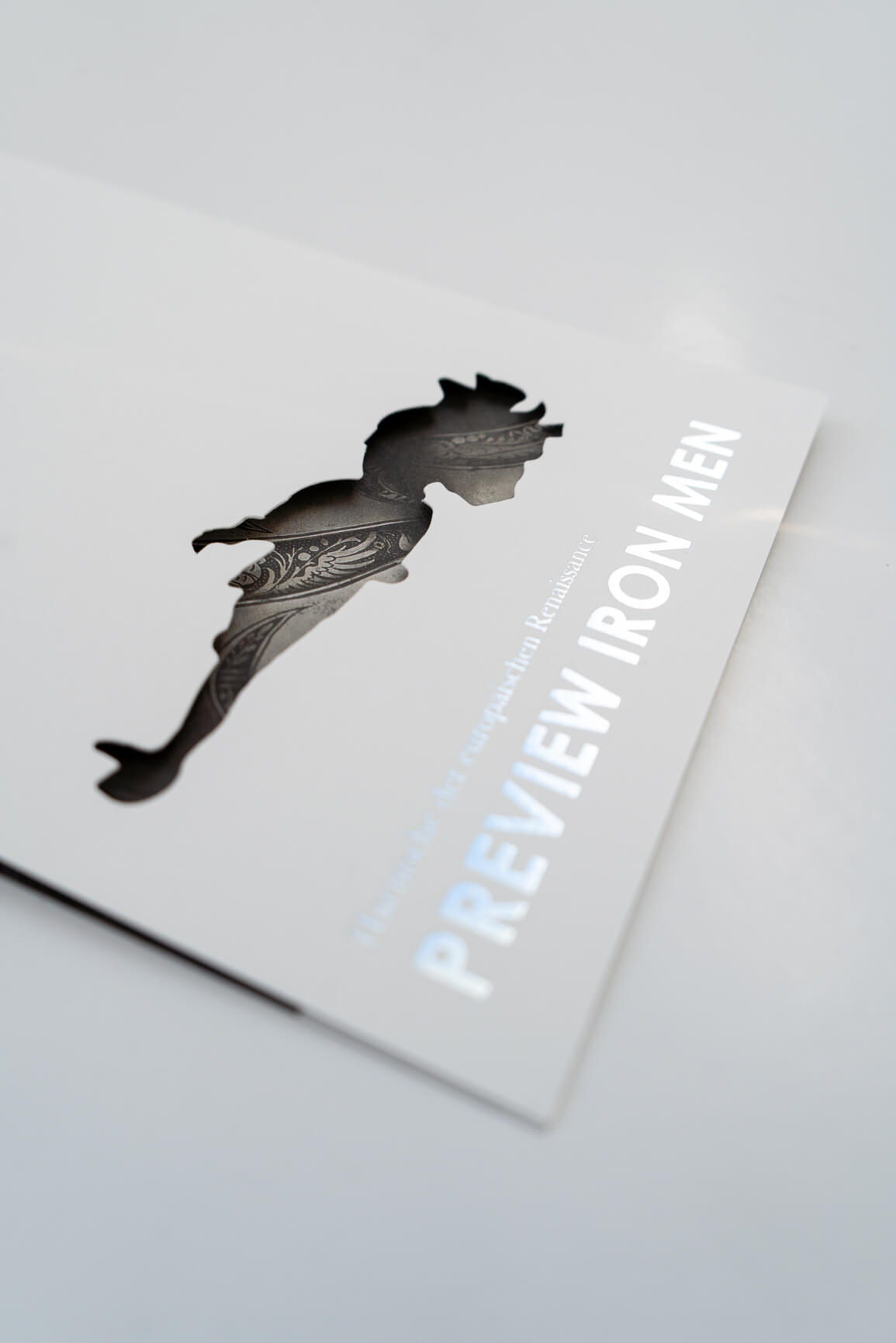
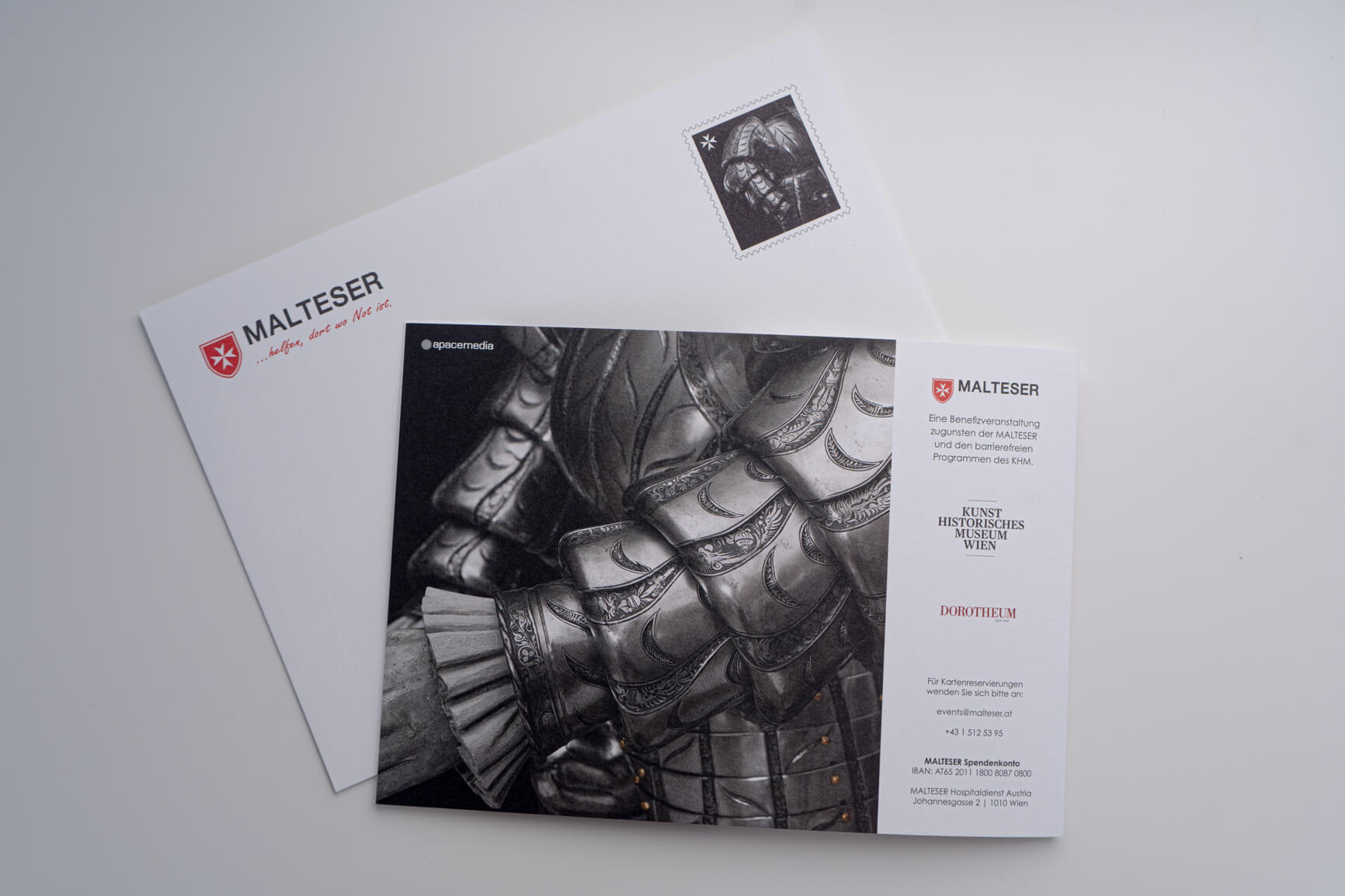
Reflecting the title of the event “Preview Iron Men – Armour of the European Renaissance”, a silhouette of a knight was die-cut on the front of the invitations as a visual highlight and to emphasise the character of the event. The glossy appearance of the armour was created using silver foiling. The inside pages were finished with UV coating. The focus was on a clear typography and the images of the collection to allow plenty of room for imagination of the viewer. The envelopes and invitation cards were printed on high-quality, coated Munken paper to enhance the exclusivity of this charity event with an exceptional feel.
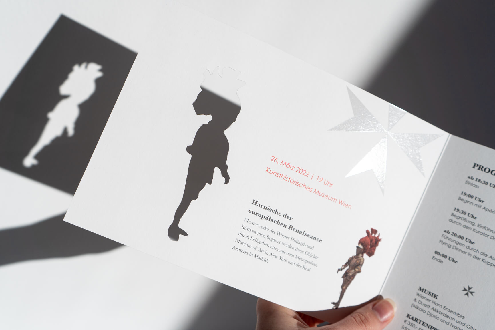
The invitations incorporate special finishes, a die-cut in the shape of a knight’s armour, UV coating of the crosses of Malta and silver embossing on the front title. High-quality, personalised envelopes with special stamps were produced to match.
The unique part of this case lies in the individual production of the invitation cards. In the design, we played with the brilliance and shapes of the knight’s armour and, thanks to the different finishing techniques and the unusual production process, we created a distinctive and unique product which will leave a lasting impression on the addressee.
The MALTESTER Hospital Service is part of the Austrian Order of Malta, which is primarily responsible for emergency, social and aid services and care facilities for the elderly and sick. In addition, there are also religious pilgrimages and journeys and the MALTESER Heart’s Desire. With the help of fundraising events like the private exhibition “Preview Iron Men”, they generate donations for people in need.

Following a detailed briefing from our long-term partner MALTESER Hospitaldienst, the first drafts of the invitation were created and the options for a variety of formats and finishes discussed. There are a number of possibilities for this type of printed products, depending on budget and lead time for production. The decision fell on a classic DIN A5 landscape format, based on our client’s previous event invitations. This was matched by a DIN C5 envelope with the MALTESER logo and sender’s details printed on it. A customised stamp was designed according to the corporate design guidelines and with photographic material of the artefacts for a clear visual reference to the exhibition.
As a visual highlight and to emphasise the nature of the event, the silhouette of a knight was die-cut on the front of the invitation and a silver embossing was applied to create a shine on the armour titled “Preview Iron Men – Armour of the European Renaissance”. The inside pages were finished with UV coating. The focus was on a clear typography and the images of the exhibits, which were visually enhanced to appear noble when viewed. The envelopes and invitation cards were printed on a high-quality, uncoated Munken paper in order to underline the exclusivity of the charity event using an extraordinary feel.
IMPRINT | COOKIES | PRIVACY POLICY | GTC