
Ernest Training GmbH
Automotive
2020
On recommendation, Ernest Training has contacted us with the desire to create a corporate design for their company. The design had to be suitable for all future communication sources and be highly recognizable.
Ernest Training’s visual identity is now consistent and clear. The new style reflects the professionalism of the company with a unique logo and corporate design. By special request, the family crests have been incorporated into the distinctive design.
One of the special features of this project was the elegant finishing of the new business cards. A high embossing of the crest was chosen for this purpose. The business cards are now not only a visual highlight but also impress with their special haptic.
Ernest Training provides a variety of advanced training and education for managers in the automotive industry. Customers value their professional approach to projects and combine a high-quality performance with the aspirations of tomorrow’s mobility.
We discussed the company’s expectations and defined objectives during a joint kick-off meeting. The client’s wish was to integrate their family crest into the corporate design.
The three variations of the family crest formed the basis for their future design. Therefore, a first draft of the logo was designed using the three photographs of the crests. The biggest challenge was to combine the individual parts of the crest variations into one so that it resulted in a coherent and unified image.
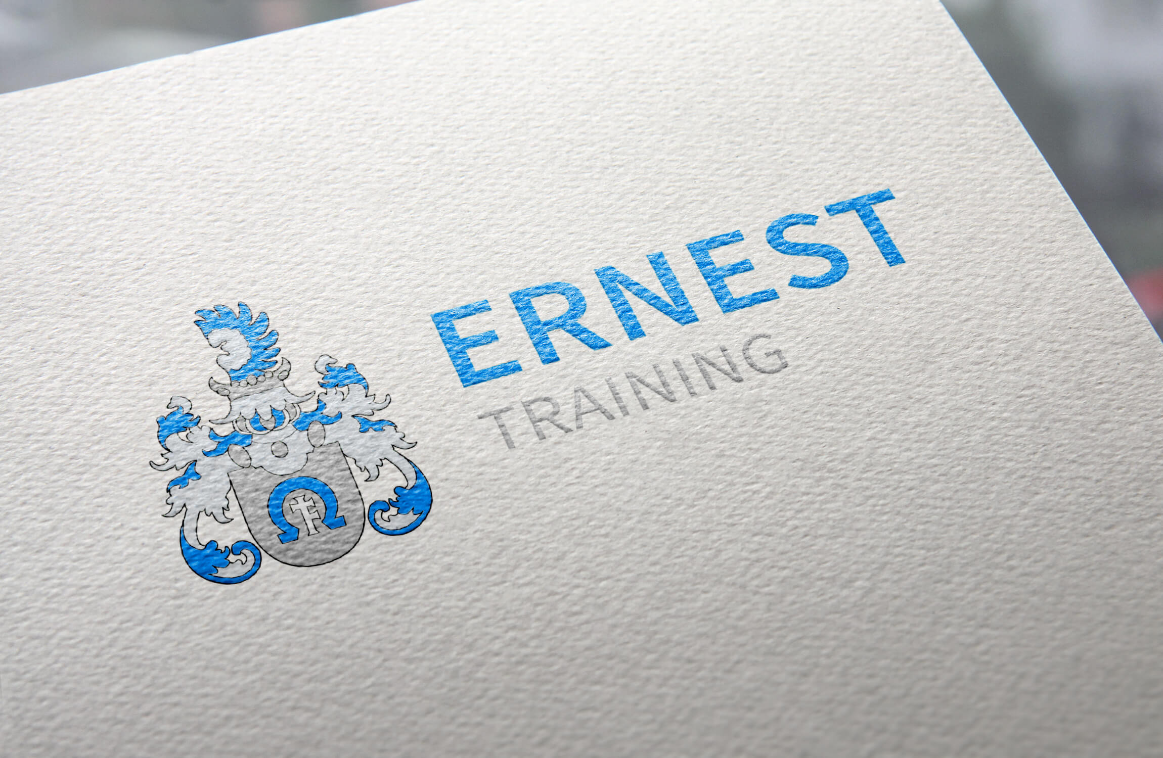
The primary logo, which is also to be used inverted, consists of the signet – i.e. the crest – and the typeface. Together, it results in a word-picture brand, which is also used for other family businesses following an adaptation of the name and color scheme.
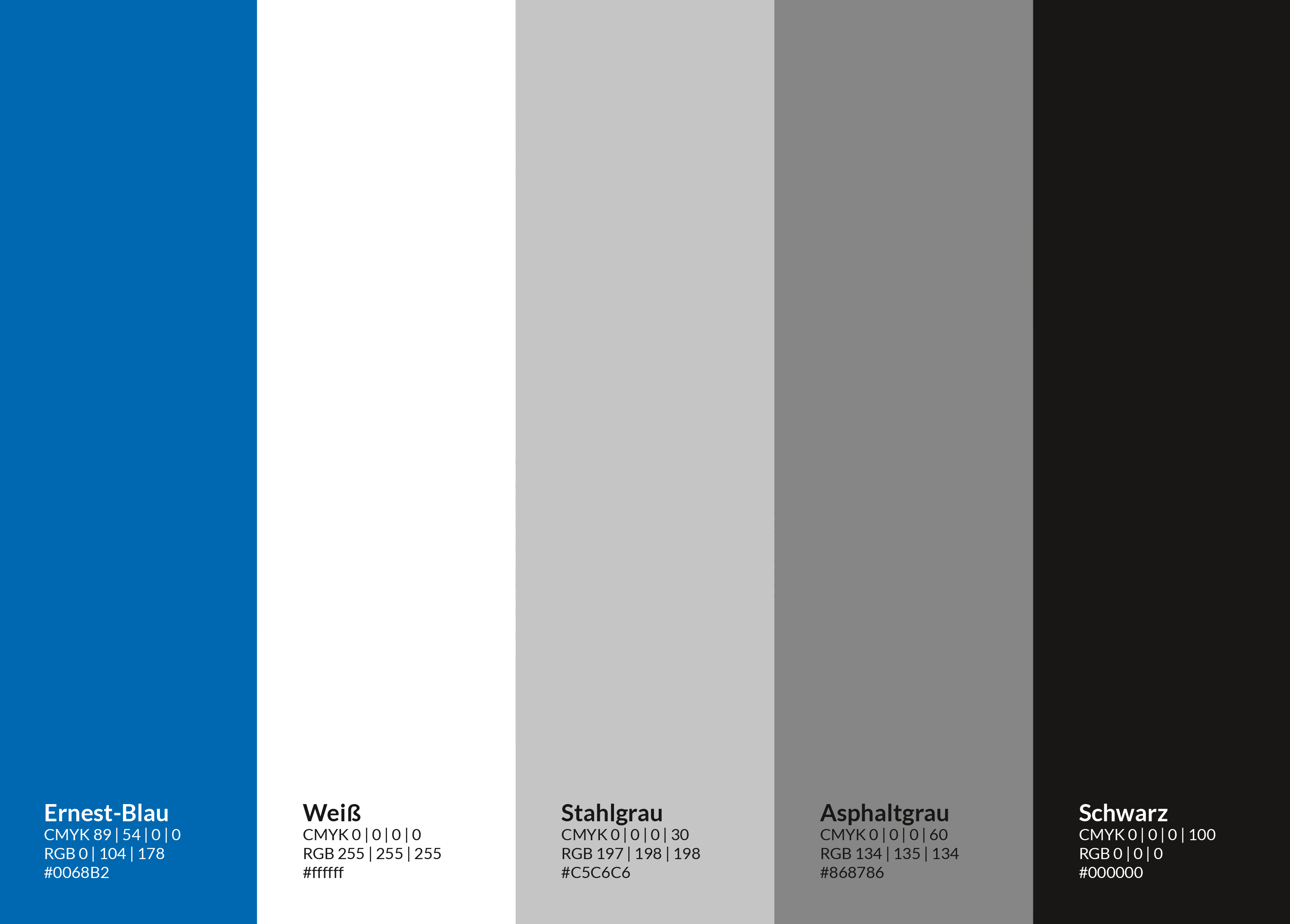
The “Ernest blue” is the primary color of the company, used in combination with the light “steel grey” and the “asphalt grey”, which appears darker. In the psychology of colors, these shades represent trust, knowledge, neutrality, reliability and professionalism. These were combined throughout the corporate design using a lot of white space to allow the eye to focus on the essentials – the recognition and acknowledgment of the company.
Ernest’s corporate font is “Open Sans”, which is used for print materials and on their website. “Calibri” is used for open documents, as this is preinstalled on all PCs and therefore easier to use within the company. Both types are so-called “Sans Serif” fonts, which are generally easy to read and which reflect the clarity and a modern style at Ernest Training.

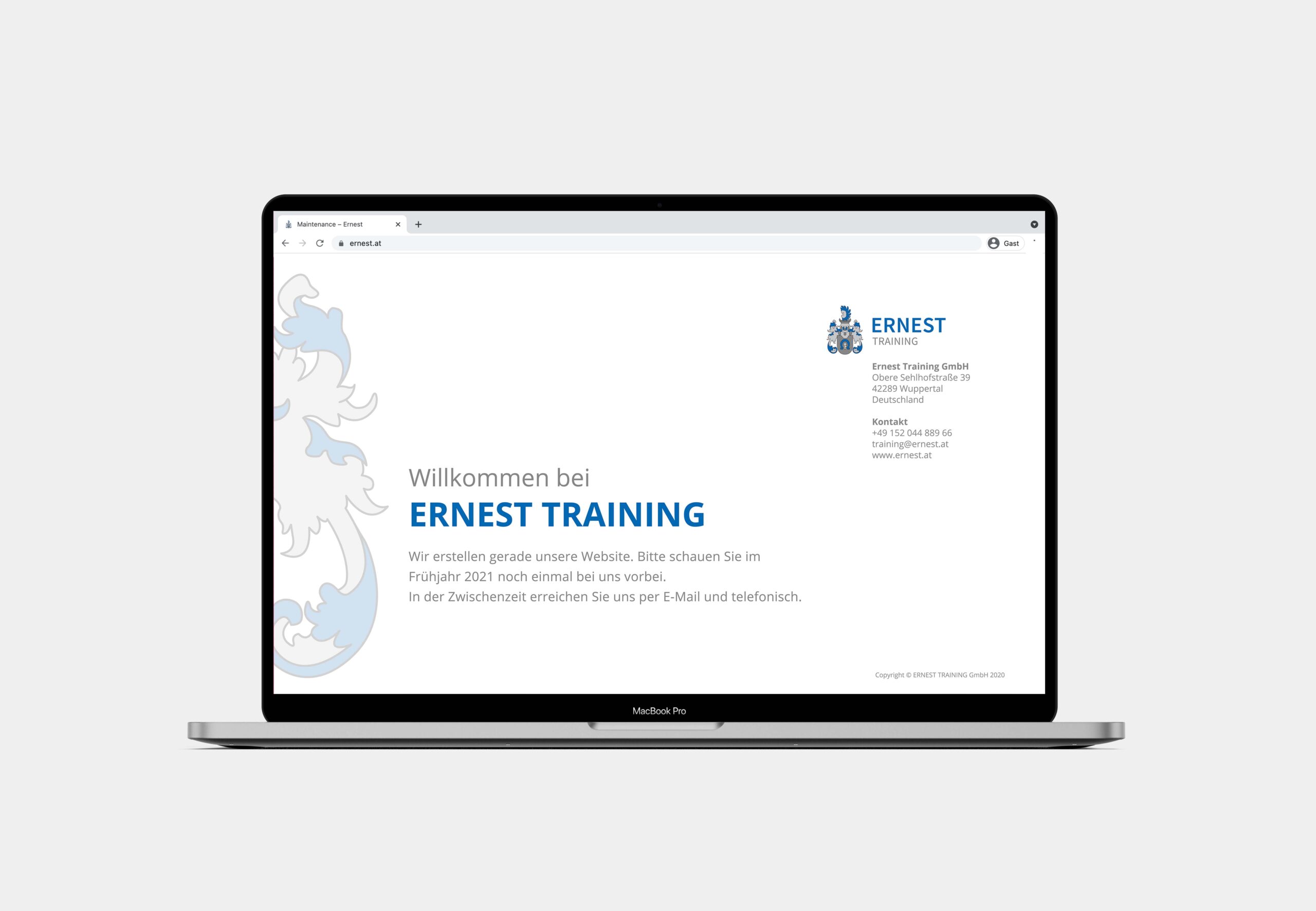
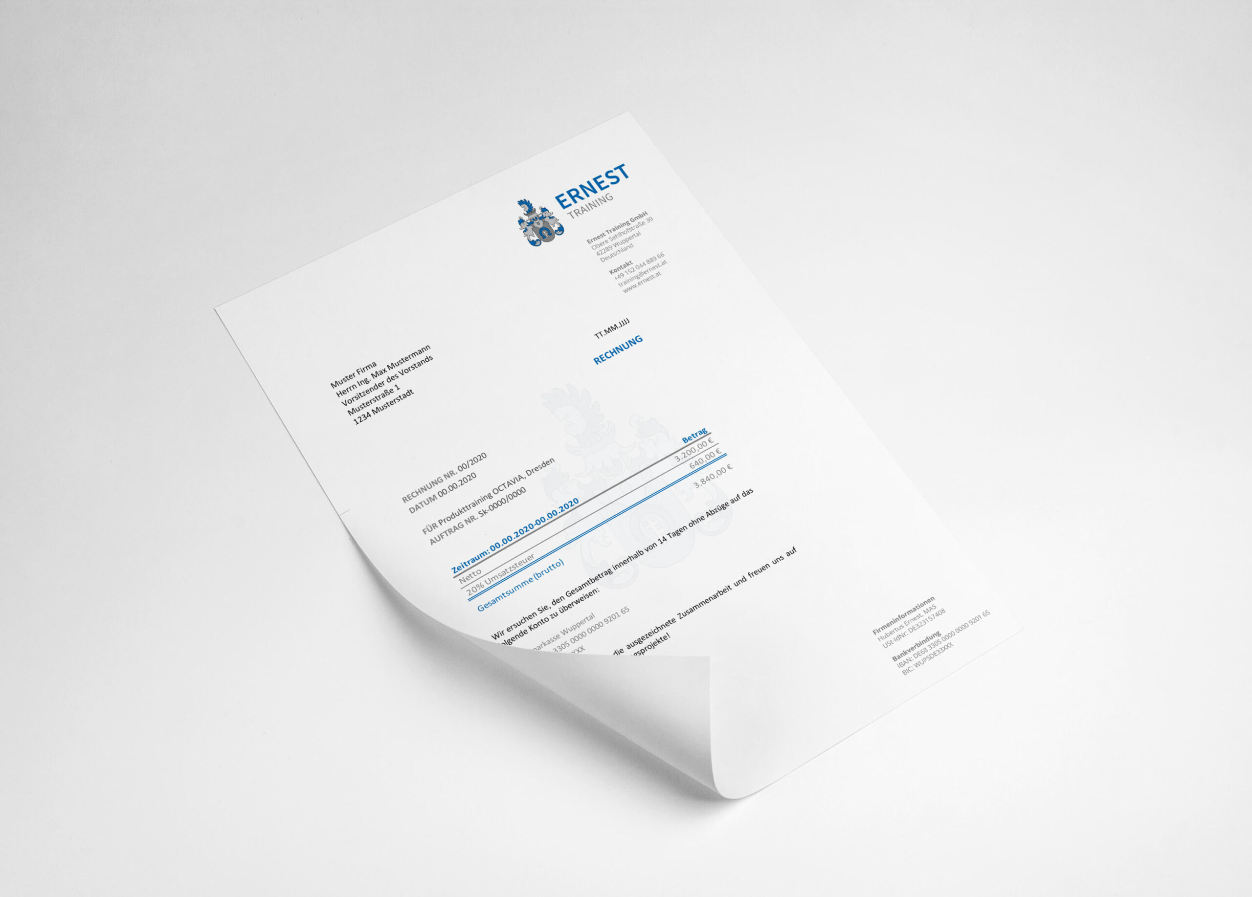
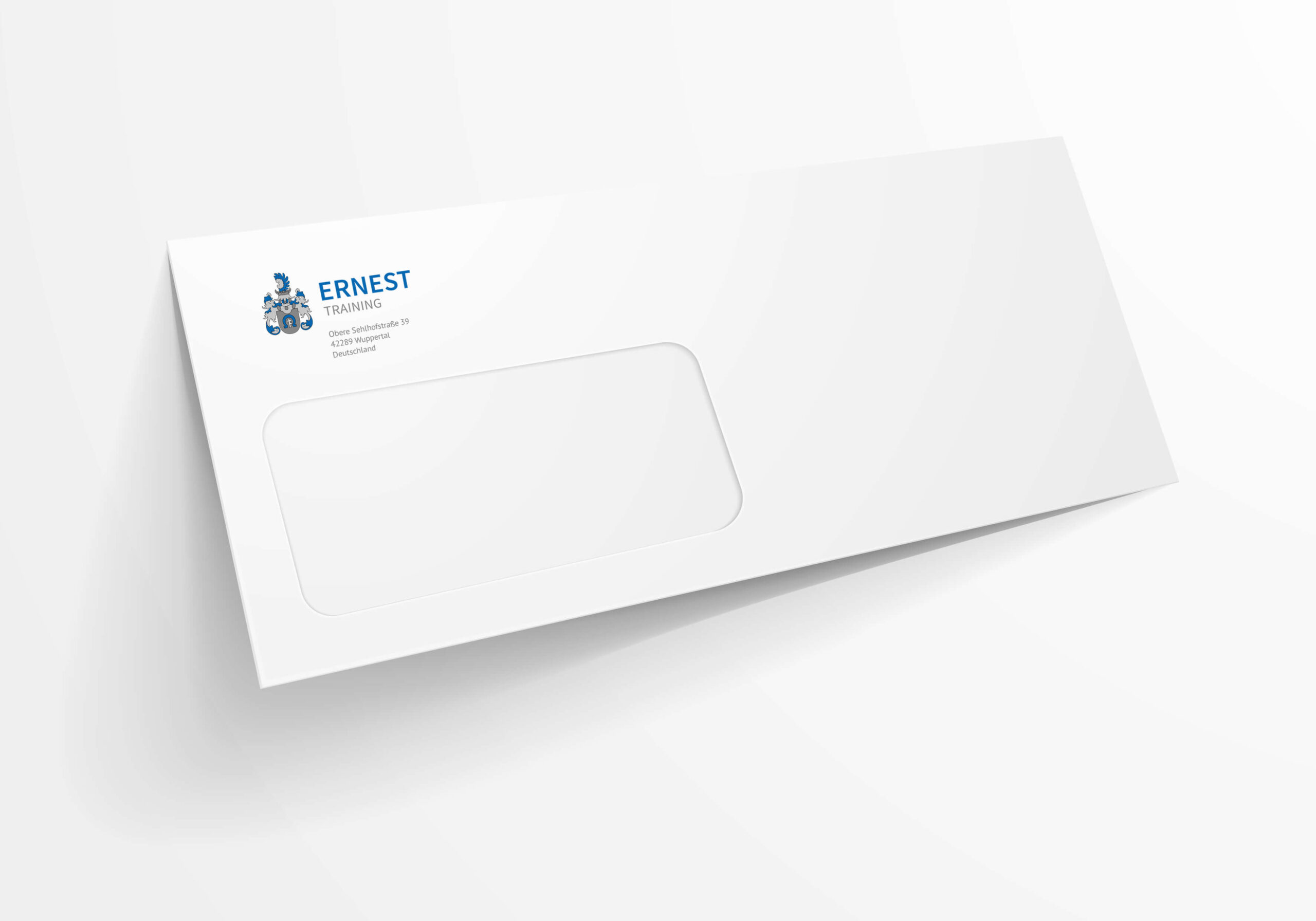
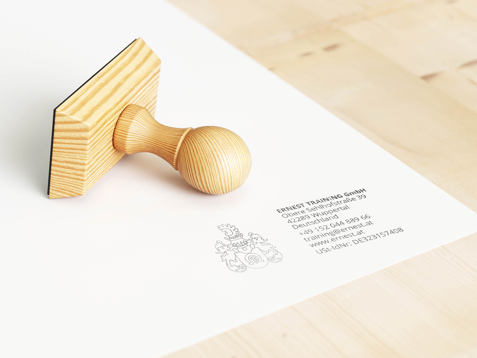
Based on the new logo, color system and corporate fonts, different designs were developed and prepared to be printed. The new branding appears on the company’s business cards, letterhead, envelopes, stamps, invoice templates, email signatures, various Microsoft document templates and on the company’s maintenance page.
The company’s crest, as an example, is embossed on the business cards and finished on high-quality paper. A blind embossing was chosen, which makes the outlines of the logo haptically stand out. The back features a part of the crest as a stylistic element and the contact details of the respective person using their corporate font.
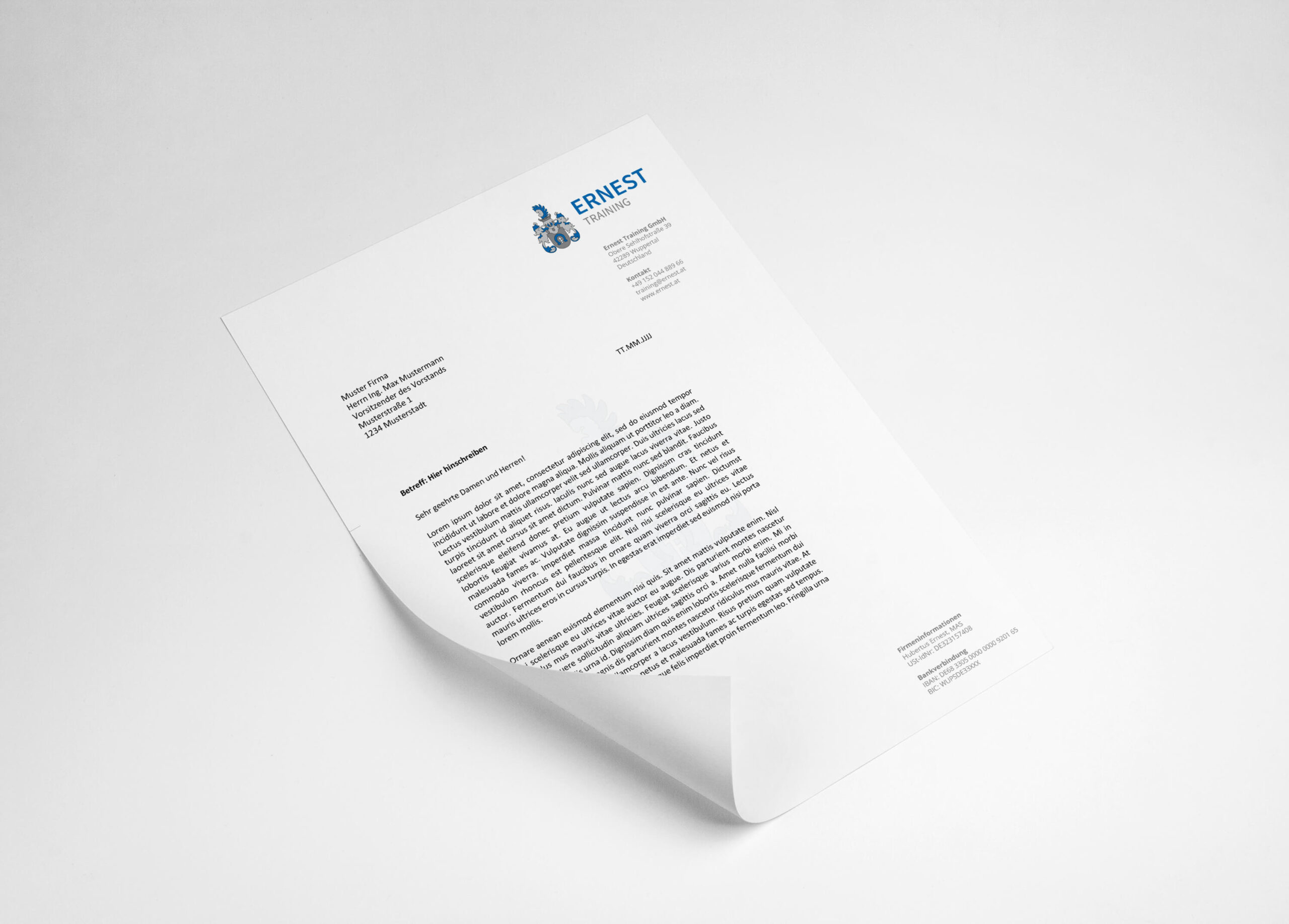
The letterhead features the logo in the background with a slight transparent finish. There are two different envelope formats to match, created in accordance with the current mailing guidelines. For the stamp, we used the outline of the logo. Furthermore, we created an email signature, an invoice template in Word which can be linked directly to Excel, an updated presentation template and a maintenance graphic for the planned website of Ernest Training.
IMPRINT | COOKIES | PRIVACY POLICY | GTC